


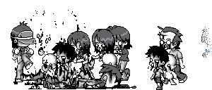
Hiya, this is my tomb raider entrance lol
I can't decide whether to have the sun effect/theme, or a night effect/theme.


Results 1 to 10 of 18
-
 Tomb Raider - 24/7 auto game entrance
The day I get to 200 in Ping Pong II is the day my life is complete.
Tomb Raider - 24/7 auto game entrance
The day I get to 200 in Ping Pong II is the day my life is complete.
-
I think it all looks pretty cool, but please get rid of the horrid light blue background fgsdgfhgsd. Room background toners look awful most of the time.
After that, I think the Sun would look good either way /
/
-
03-03-2013, 03:09 PM #3

I always prefer daytime themes to nighttime themes
I really like this room, all the furni fits well together IMO and nothing looks out of place apart from the group furniture (which can't be helped, sadly). I guess I would like it if it were a little smaller, but if it's going to be packed all the time it would be easier for it to be in a big room. I'm not really sure what else there is to improve on Well done


-
03-03-2013, 03:15 PM #4
- Join Date
- Feb 2008
- Location
- London, UK
- Posts
- 15,747
- Tokens
- 25,786
- Habbo
- Mr-Trainor
As I said yesterday, I think it looks great
 ! I agree with trying both night/day theme without the blue background though. But I can't really decide which effect is better .

Not online very often
-
ty for comments, any improvements i could do??
The day I get to 200 in Ping Pong II is the day my life is complete.
-
08-03-2013, 07:57 PM #6

- Join Date
- Feb 2013
- Location
- Singapore
- Posts
- 179
- Tokens
- 142
- Habbo
- chemidann95
eh, I would prefer nightime/daytime or w/e. For me, I think this is perfect already although there are some room for improvement. You just need to remove the blue thing.
A friend should be one in whose understanding and virtue we can equally confide, and whose opinion we can value at once for its justness and its sincerity.
-
08-03-2013, 09:58 PM #7
Agree with what the others have said; I'd like to see the background colour removed, but the rest of the design I do really like.
Search Varnius for Habbo's Official Trading Room.
-
the sun and waterfall look weird but apart from that looks great
-
09-03-2013, 09:33 AM #9
I DID TELL HIM TO REMOVE TONER GUYS I RLLY DID!!!!!!!!
-
Sigh I'm just getting bored of seeing this design all the time, like really, it's getting so boring. I don't see why people couldn't change the runs up a little bit instead of doing jungle themes, just like Gordone's first one. Best of luck with it


 Reply With Quote


 Posting Permissions
- You may not post new threads
- You may not post replies
- You may not post attachments
- You may not edit your posts