


")
I really like it, going to make it my default for a while


View Poll Results: Do you like The Dojo?
- Voters
- 51. You may not vote on this poll
-
Its Amazing!
14 27.45% -
Its alright, I guess...
27 52.94% -
Hate It!
5 9.80% -
Don't really care? LOOL
5 9.80%
Results 11 to 20 of 97
Thread: The Dojo
-
18-11-2012, 04:42 PM #11

-
18-11-2012, 04:46 PM #12
I really like it but think the banner at the top's a bit big but other than that it's really nice
-
text boxes are a little hard to see, i had to click around to find it
 . can they have a darker outline or something? @hamheyelliot;


-
18-11-2012, 05:33 PM #14
- Join Date
- Feb 2006
- Posts
- 24,716
- Tokens
- 62,136
- Habbo
- FlyingJesus
I don't really like the top links being centred, think it makes it look a bit disjointed and would look better left-aligned to match up with the edge of the rest of the page, but otherwise it's ok yeah. Still gonna stick with site 2010 though
-
18-11-2012, 05:33 PM #15

- Join Date
- Dec 2007
- Location
- Manchester
- Posts
- 2,236
- Tokens
- 118
- Habbo
- hamheyelliot
No problem, will sort the forms out fully tonight! Originally Posted by David

The size of the banner has now been chopped down, and if you've filled out your Habbo details in your User CP, it will appear in the top left instead of Matt, a nice suggestion from Mr Kieran.
-
18-11-2012, 05:41 PM #16
I think its a great skin, I realy like the mix of habbo and non-habbo. Good job!
 Former General Manager
Former Forum Manager
Former Site Manager
I've left, but I still visit sometimes!
-
18-11-2012, 05:43 PM #17
any way of changing it so its as wide as the site skin 2011?
and the logo moving up when hovering over it is pointlessLast edited by mrwoooooooo; 18-11-2012 at 05:47 PM.
-
no dont change the width it's fine as it is
-
just an fyi - The 'icon legend' part hasnt been changed Originally Posted by hamheyelliot
/
-
18-11-2012, 05:55 PM #20
Ok, thoughts.
I quite like it, but as soon as I saw it I was more like "Oh, right..." instead of "Oh my gosh, this is amazing!".
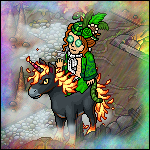
I'm not a big fan of the "banner" (HabboxForum bit) but I do like the fact the Habbos seem to have super powers. I like the width, so make sure you keep that - and I like the text, woo ok.
Overall: not certain yet, I'll see if it grows on me.

 Reply With Quote


")


 Posting Permissions
- You may not post new threads
- You may not post replies
- You may not post attachments
- You may not edit your posts