


I like it.
Results 11 to 20 of 26
-
07-03-2015, 06:24 PM #11

- Join Date
- Oct 2011
- Location
- England
- Posts
- 566
- Tokens
- 1,623
- Habbo
- Explorator
 今日は
今日は

-
07-03-2015, 06:44 PM #12
- Join Date
- Aug 2011
- Location
- Canada
- Posts
- 2,921
- Tokens
- 5,364
- Habbo
- OldLoveSong
super cute background and love the font colour u chose. imo the text placement doesnt seem right tho and could be a bigger font. great job


xo.
-
07-03-2015, 07:24 PM #13

I love it! Not quite a fan of the font when it says 'Just ask' I don't think that flows very well with it!
Awesome job tho!!
I'm not perfect but I'll keep trying.
-
08-03-2015, 05:57 AM #14
 No it's good that you've posted it!! I agree with the others. I think it's really good. The only thing I'm not totally keen on is the white text under the Habbox Help Desk title, but that's only something really minor. If you were to change that to something that suited the banner a bit more, then it would be even better! But I think it's a really cute banner overall. Constructive critisicm is there to help you improve, don't let it deter you from posting your work in the future. You are really talented and i'd definitely encourage you to post more of your graphics. It's something i'd never have the patience to do so just learn from the feedback. It's all about the learning!!
 Originally Posted by Terregan

-
08-03-2015, 08:13 AM #15
 Thanks a lot! Originally Posted by mdport.
-
08-03-2015, 09:06 AM #16
 Help Desk Assistant Manager
HabboxLive Senior DJ (DJ welshcake)
Rare Values Staff
Events Organiser


I think the theme is cute. But I agree with the volter text being too big but also shadows? Where are they? :S
the position of Kelly and Sho on the pillows is off too and yeah, top left corner there is some sort of black thing idk what that is. Few empty spaces too and maybe the main text needs some gradient or at least a drop shadow. But nice one, well done.
-
08-03-2015, 12:35 PM #17
AWWWWW SO CUTE hi hxhd heres ur new banner
-
04-04-2015, 11:07 PM #18
 Habbox Hall of Fame Inductee Former Rare Values ManagerHabboxForum Top Poster

- Join Date
- Jan 2006
- Location
- Mijas, the Kingdom of Spain
- Country

- Posts
- 28,693
- Tokens
- 384
- Habbo
- -:overtaker:-
A very sweet banner, would be cool for the bunny to have a face though.


-
Awhh it's so cute :3 the little strawberrys agh I want to eat one
-
The black on top left corner is distracting.
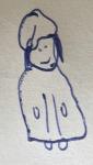
The girl in grey looks creepy and like the place is not friendly.
The bunny looks weird as it has no face.
The font on "Need help? Just ask!" needs improving as "ask" is not clear.
Apart from the above, good try.

 Reply With Quote

")


 Posting Permissions
- You may not post new threads
- You may not post replies
- You may not post attachments
- You may not edit your posts