

I love Ikea


Results 1 to 10 of 18
Thread: Ikea!
-
 Ikea!
Ikea!
-
blue needs to be darker.
When theres no more room in hell, The dead will walk the earth!
-
I like it, you have put very nice detail on the roof.
The picture looks strange quality though, save as Png
8/10Rep Count:
25 >> 50 >> 75 >> 100 >> 125 >> 150
-
EUGH @ default colours.
Other then that
7/10.
Defaults ruin it.
It is bmp made into JPG with an uploader:rolleyes:Last edited by Boonzeet; 18-12-2007 at 05:06 PM.
-
nice idea, hope u asked ikea's permission to make this...

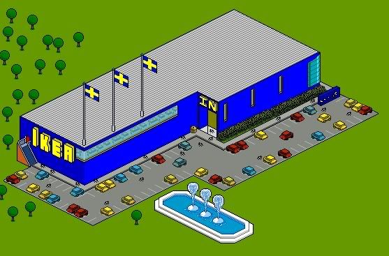
only problem are the pixelerror's and things I cant see what they are or what u tried doing there...
pixelerror's: you first put the flags on the roof and then did the lines, because of this the lines dont run through at the same height.
the bushes in front of the store... at the left they are higher then at the right and u see it clearly if u llook at the bottom, on the left u got a light green wich fades away to the right.
the 3 windows on the right: I didnt know if u did it on purpose or not but the middle one seems to be slightly higher then the others.
the trashcan: it just looks odd... bit too big for the size you did the rest in and you could work it out a bit better.
text: the I in ikea on the left has a 3D problem on top, it isnt in a 45° angle there. same for the N in "in", needs a bit of yellow removed on top.
for the rest: I wouldnt have a clue what the white dots with cracks around are on the parkinglot and same goes for the big blue plate on the right.
what I would do to improve it: place the fountains at the gap at bottom where they are but turn them so they go in same length as the parkinglot. and also make an entrance to the parkinglot since it's now just a building with a parkinglot and cars and people being trapped in a place somewhere, surrounded by trees and grass.
nice idea and nice try tho so I'll give it a 7/10
-
+rep I like it. The dark blue is ugly, change it to a different color or tone.
*Text Removed*
Edited by opensourcehost (Forum Super Moderator): Please do not have signature that break the font size limit, are inappropriate or ask for reputation.
-
the field looks plain with no tree's and default is ugglyy soz
If your actions inspire others to dream more,
learn more, do more and become more,
you are a leader.
Habbo eXpert
-
Luvin the file save name?


8/10 For alt.


-
whats your point?
 Originally Posted by Xzoid

I like it.
As said, the blue could probably be changed up a bit.formerly liquidaciid
-
I just didn't expect "JoshLovesAlex" as part of a file save name thats all. Originally Posted by LiquidAciid


 Reply With Quote


 Posting Permissions
- You may not post new threads
- You may not post replies
- You may not post attachments
- You may not edit your posts